Configuring multiple columns for print in HTML/CSS
When creating print documents like academic journals, brochures, and newspapers, it's common to use multiple columns to make the content more readable. In this guide, we'll look at how to configure multiple columns for print documents in HTML/CSS.
Using the column-count property
The column-count property is used to specify the number of columns an element should be divided into. Here's an example of how to use it:
.selector {
    column-count: 2;
}
Where .selector is the CSS selector you want to apply the columns to, and 2 is the number of columns you want to divide the element into.
For example, let's consider this academic journal that we want to display in two columns:

Here, we want to apply the two-column layout only on the body content and not the title or subtitle. When we uncomment the column-count selector from the .content class, we get the following result:
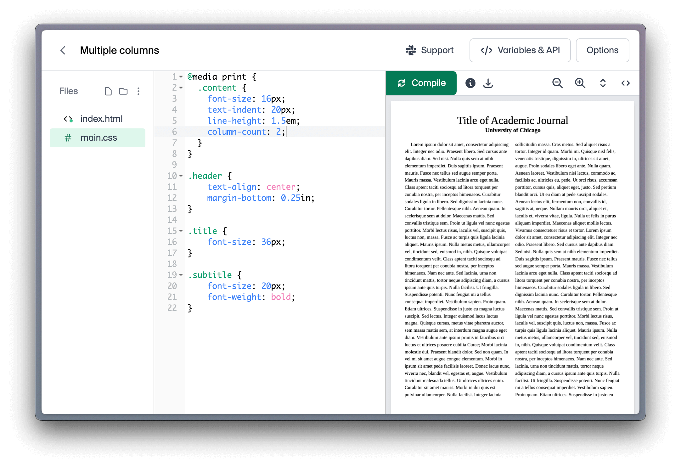
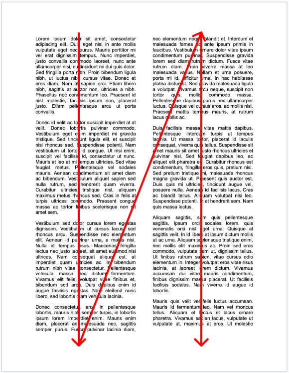
The text is now divided into two columns, and will wrap after overflowing the first column, like a zig-zag pattern.
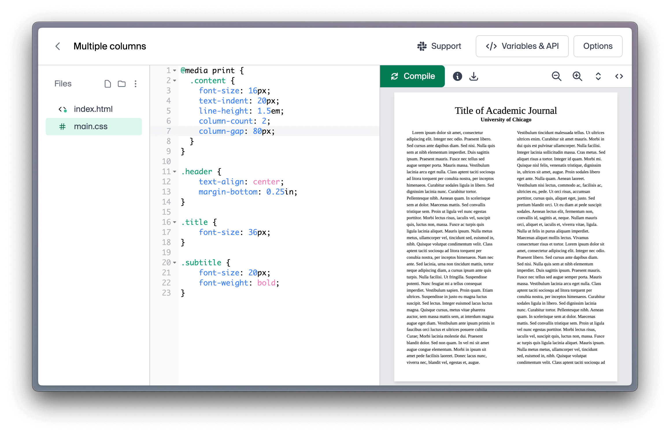
Adjusting the gap between columns
The column-gap property is used to specify the gap between the columns. Here's an example of how to use it:
.selector {
    column-count: 2;
    column-gap: 80px;
}
And the result, where we increase the gap between the columns to 80px:
Creating columns with flex
Sometimes, you might not want to wrap content in a column that overflows to the next column.
Instead, you might want to position elements side by side, like such:
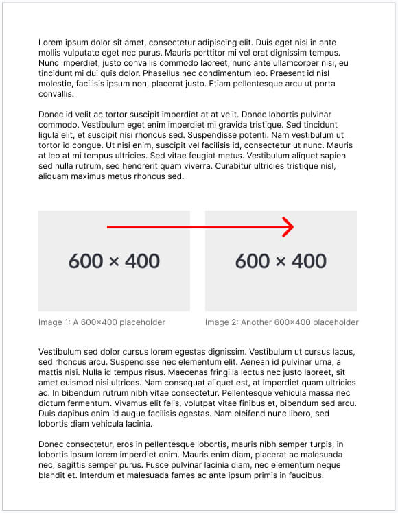
To do this, you can use the flex property to create columns. Here's an example of how to use it:
.img-row {
    display: flex;
}
<div class="img-row">
    <img src="image1.jpg" alt="Image 1" />
    <img src="image2.jpg" alt="Image 2" />
</div>
In this example, the img-row class is used to create a row of images. The display: flex property is used to make the images appear side by side.
You can further configure the layout using the following properties:
-
flex-gap: Defines the space between flex items. It can be used to easily create consistent spacing between items in a flex container..img-row { display: flex; gap: 20px; /* This creates a 20px gap between each column */ } -
align-items: Controls the alignment of items on the cross axis (perpendicular to the main axis, which is the horizontal axis in this case)..img-row { display: flex; align-items: center; /* This vertically centers items in the container */ } -
justify-content: Controls the alignment of items on the main axis (horizontal in this case)..img-row { display: flex; justify-content: space-between; /* This adds as much space as possible between the items */ /* justify-content: center; // This horizontally centers the items */ } -
flex-direction: Controls the direction in which the flex items are laid out. Set torow(horizontal) by default. Changing this tocolumnwill invert thealign-itemsandjustify-contentproperties..img-row { display: flex; flex-direction: column; /* This lays out the items in a column instead, creating a vertical layout */ }